
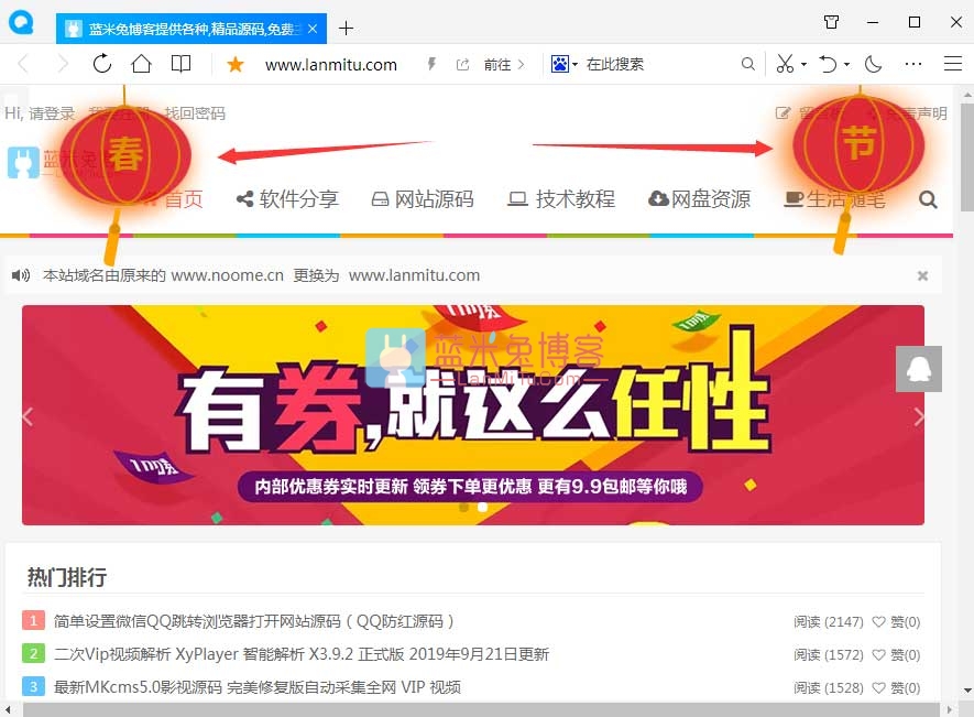
大家好,新年新气象,给自己博客挂个灯笼,可以增加点过年的气氛。虽然如今已没啥过年的气氛了。
这两个灯笼只是简单应用一下CSS3动画,纯HTML+CSS手敲出来的,由于时间短写的不是很严谨,但不影响使用,食用方法也很简单。
先看下效果图:
第一步、添加HTML代码
将下面的HTML代码添加到wordpress主题页脚模板footer.php,标签的上面。
<!-- 灯笼1 -->
<div class="deng-box">
<div class="deng">
<div class="xian"></div>
<div class="deng-a">
<div class="deng-b"><div class="deng-t">节</div></div>
</div>
<div class="shui shui-a"><div class="shui-c"></div><div class="shui-b"></div></div>
</div>
</div>

<!-- 灯笼2 -->
<div class="deng-box1">
<div class="deng">
<div class="xian"></div>
<div class="deng-a">
<div class="deng-b"><div class="deng-t">春</div></div>
</div>
<div class="shui shui-a"><div class="shui-c"></div><div class="shui-b"></div></div>
</div>
</div>
如果只想在首页显示灯笼,可以用下面的判断语句把HTML代码包裹起来:
<?php if (is_home()) { ?>
<!– 代码放这里 –>
<?php } ?>
第二步、添加样式
将CSS样式代码添加到主题css中,一般都添加到main.css里面。
.deng-box {
position: fixed;
top: -40px;
right: -20px;
z-index: 999;
}

.deng-box1 {
position: fixed;
top: -30px;
z-index: 999;
}

.deng-box1 .deng {
position: relative;
width: 120px;
height: 90px;
margin: 50px;
background: #d8000f;
background: rgba(216, 0, 15, 0.8);
border-radius: 50% 50%;
-webkit-transform-origin: 50% -100px;
-webkit-animation: swing 5s infinite ease-in-out;
box-shadow: -5px 5px 30px 4px rgba(252, 144, 61, 1);
}

.deng {
position: relative;
width: 120px;
height: 90px;
margin: 50px;
background: #d8000f;
background: rgba(216, 0, 15, 0.8);
border-radius: 50% 50%;
-webkit-transform-origin: 50% -100px;
-webkit-animation: swing 3s infinite ease-in-out;
box-shadow: -5px 5px 50px 4px rgba(250, 108, 0, 1);
}

.deng-a {
width: 100px;
height: 90px;
background: #d8000f;
background: rgba(216, 0, 15, 0.1);
margin: 12px 8px 8px 10px;
border-radius: 50% 50%;
border: 2px solid #dc8f03;
}

.deng-b {
width: 45px;
height: 90px;
background: #d8000f;
background: rgba(216, 0, 15, 0.1);
margin: -4px 8px 8px 26px;
border-radius: 50% 50%;
border: 2px solid #dc8f03;
}

.xian {
position: absolute;
top: -20px;
left: 60px;
width: 2px;
height: 20px;
background: #dc8f03;
}

.shui-a {
position: relative;
width: 5px;
height: 20px;
margin: -5px 0 0 59px;
-webkit-animation: swing 4s infinite ease-in-out;
-webkit-transform-origin: 50% -45px;
background: #ffa500;
border-radius: 0 0 5px 5px;
}

.shui-b {
position: absolute;
top: 14px;
left: -2px;
width: 10px;
height: 10px;
background: #dc8f03;
border-radius: 50%;
}

.shui-c {
position: absolute;
top: 18px;
left: -2px;
width: 10px;
height: 35px;
background: #ffa500;
border-radius: 0 0 0 5px;
}

.deng:before {
position: absolute;
top: -7px;
left: 29px;
height: 12px;
width: 60px;
content: ” “;
display: block;
z-index: 999;
border-radius: 5px 5px 0 0;
border: solid 1px #dc8f03;
background: #ffa500;
background: linear-gradient(to right, #dc8f03, #ffa500, #dc8f03, #ffa500, #dc8f03);
}

.deng:after {
position: absolute;
bottom: -7px;
left: 10px;
height: 12px;
width: 60px;
content: ” “;
display: block;
margin-left: 20px;
border-radius: 0 0 5px 5px;
border: solid 1px #dc8f03;
background: #ffa500;
background: linear-gradient(to right, #dc8f03, #ffa500, #dc8f03, #ffa500, #dc8f03);
}

.deng-t {
font-family: 华文行楷,Arial,Lucida Grande,Tahoma,sans-serif;
font-size: 3.2rem;
color: #dc8f03;
font-weight: bold;
line-height: 85px;
text-align: center;
}

.night .deng-t,
.night .deng-box,
.night .deng-box1 {
background: transparent !important;
}

@-moz-keyframes swing {
0% {
-moz-transform: rotate(-10deg)
}

50% {
-moz-transform: rotate(10deg)
}

100% {
-moz-transform: rotate(-10deg)
}
}

@-webkit-keyframes swing {
0% {
-webkit-transform: rotate(-10deg)
}

50% {
-webkit-transform: rotate(10deg)
}

100% {
-webkit-transform: rotate(-10deg)
}
}
到此教程结束,祝大家新年快乐,万事如意,心想事成。
© 版权声明
- 注意:本站资源多为网络收集,如涉及版权问题请及时与站长联系,我们会在第一时间内删除资源。
- 您购买的只是资源,不提供解答疑问和安装服务。
- 付款后如遇到无法下载的情况请联系QQ:825564。
THE END


![[Android]戒撸APP 戒色全书v3.5.1一款帮助戒色神器-蓝米兔博客](https://www.lanmitu.com/wp-content/uploads/2020/04/f183e0ff82c0f6d.png)
请登录后发表评论
注册
社交帐号登录